Project Language
A project language is the small subset of patterns you choose for one project as a shared vocabulary. These “Patterns” come from A Pattern Language by Christopher Alexander. They are the patterns this project sought to embody: recurring human needs in buildings, and practical ways of meeting those needs so a place feels more alive. They are listed here as the project’s shared vocabulary, so the built-in can be read not just as carpentry and finishes, but as an effort to strengthen wholeness, comfort, and everyday life in the room. They also give a way to judge the work. Not “does it look impressive,” but “does it make the room more whole.”
- Pattern 208 – Gradual Stiffening
- Pattern 197 – Thick Walls
- Pattern 191 – The Shape of Indoor Space
- Pattern 226 – Column Place
- Pattern 227 – Column Connections
- Pattern 212 – Columns at the Corners
- Pattern 104 – Site Repair
- Pattern 199 – Sunny Counter
- Pattern 135 – Tapestry of Light and Dark
- Pattern 252 – Pools of Light
- Pattern 134 – Zen View
- Pattern 240 – Half-Inch Trim
- Pattern 250 – Warm Colors
- Pattern 129 – Common Areas at the Heart
- Pattern 181 – The Fire
- Pattern 253 – Things From Your Life
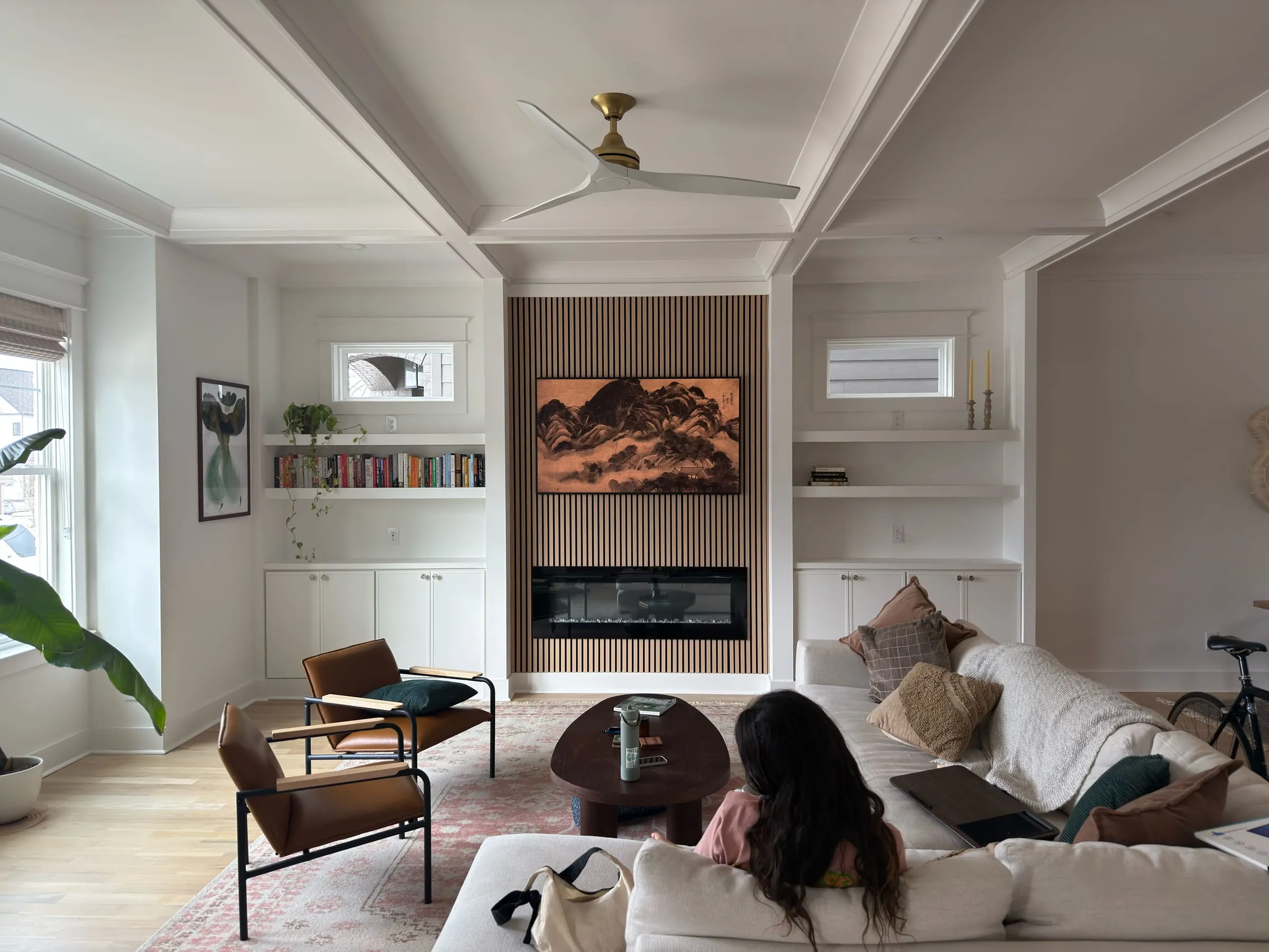
In every living room there is a need that does not speak in words. A need for the wall to become a place, not a blank edge. A need for the room to have a center that the body recognizes before the mind explains it. This project was an attempt to find the Quality Without a Name, not by adding decoration, but by giving the room depth, warmth, and a settled order that can hold daily life without strain.
I. The Columns and the Built-Out Wall
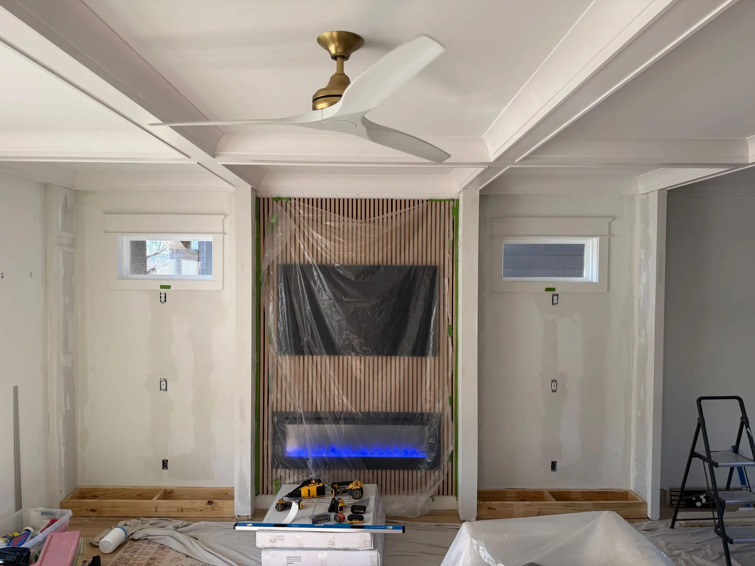
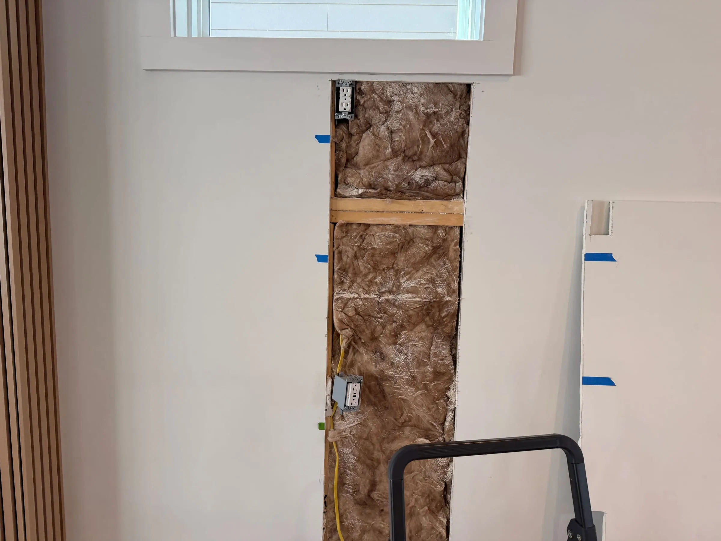
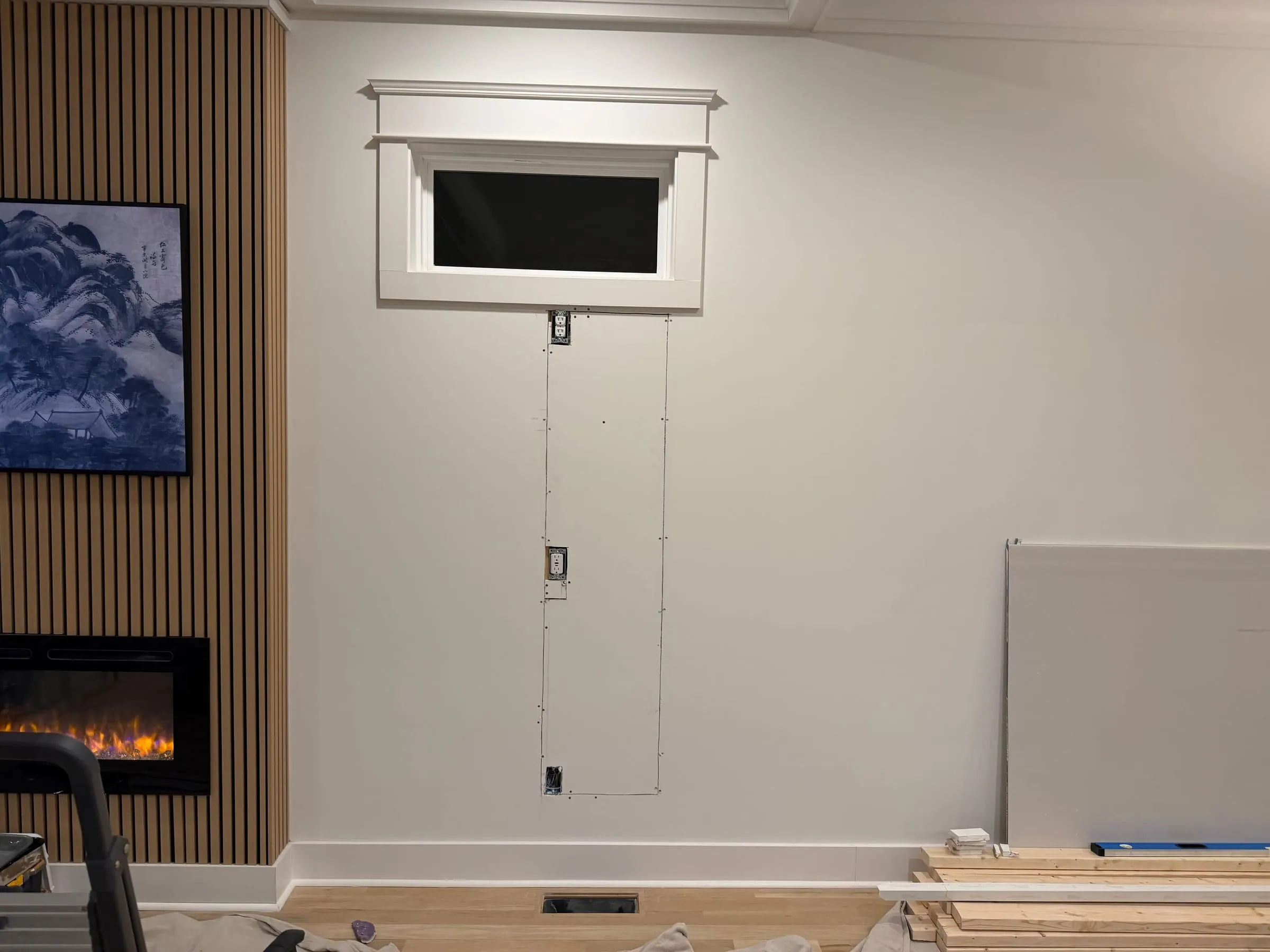
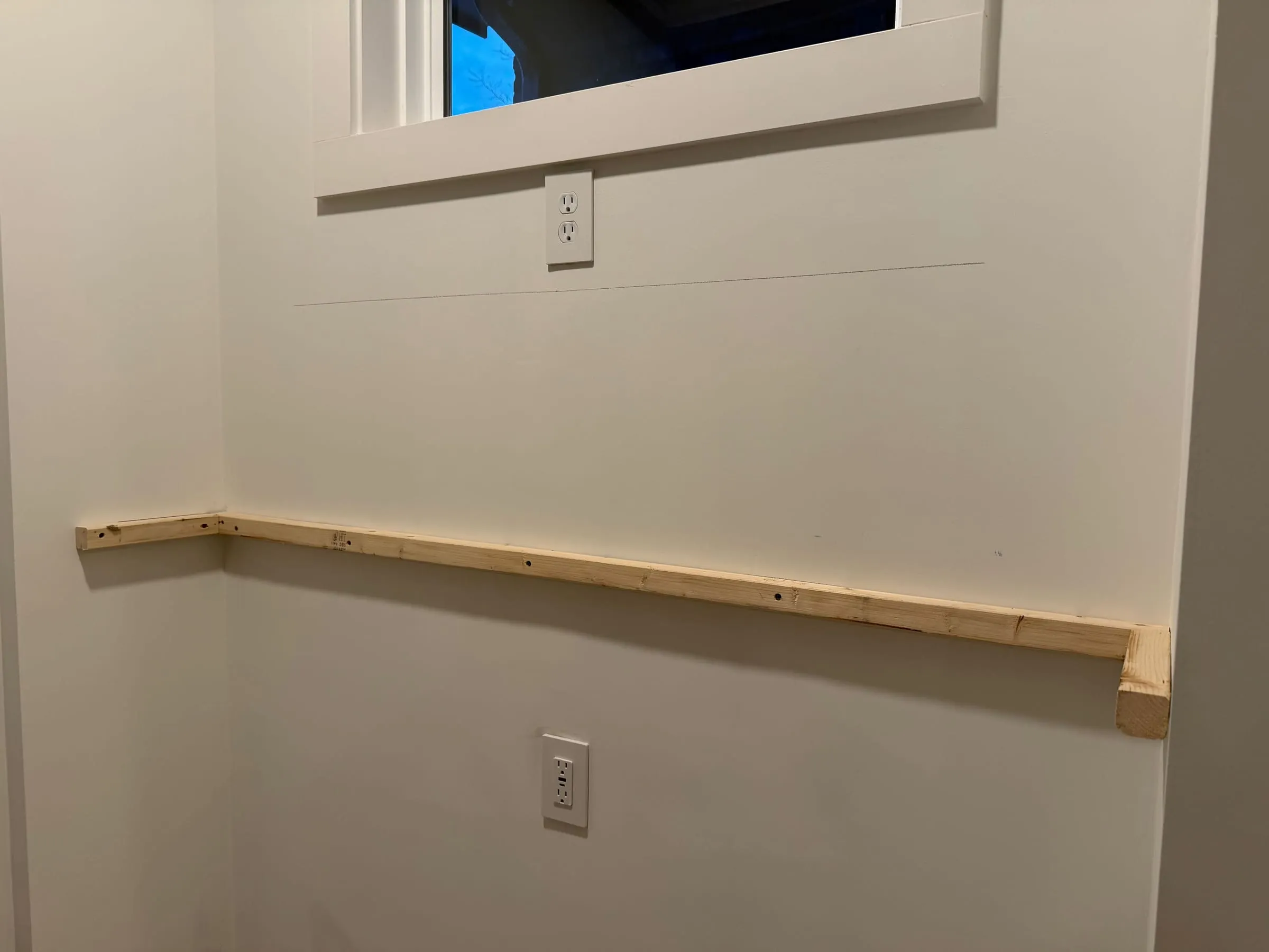
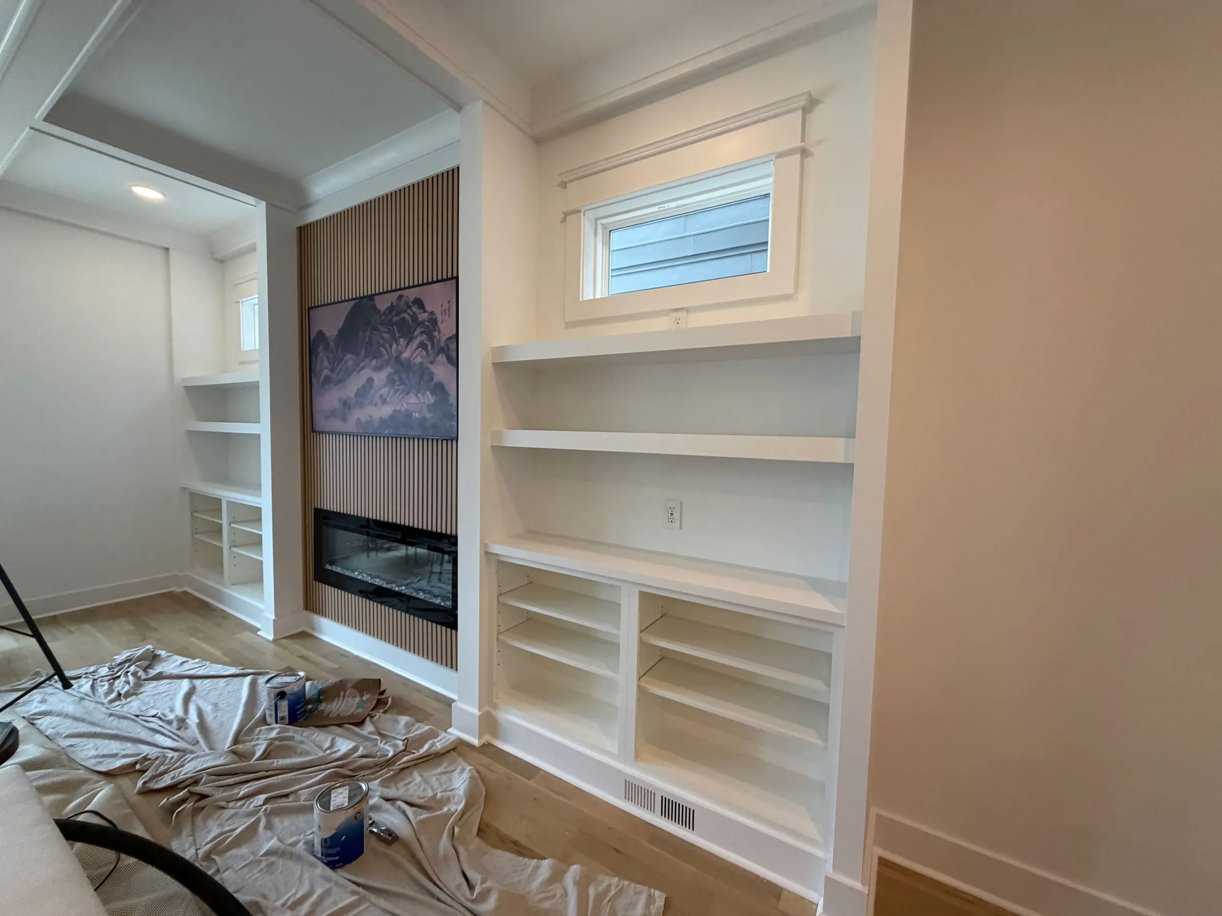
A living structure is not born all at once. It grows through gradual stiffening, by doing what is necessary, then doing what is necessary next, and letting the work reveal what it wants to become. The work began with the simple act of building the wall out, adding depth in front of it. Not for show, but so it could carry niches, edges, and recesses, the kinds of usefulness that make a room feel settled.
Non-structural columns were built up, framed in standard 2x4, where the wall already hinted at rhythm and balance. These towers were not added as furniture, and they carry no load. They were treated as part of the room’s body, creating the beginning of a column place, a vertical depth that makes the wall feel anchored. When these verticals are right, the room gains shoulders. The eye stops skittering across a flat surface and begins to rest.
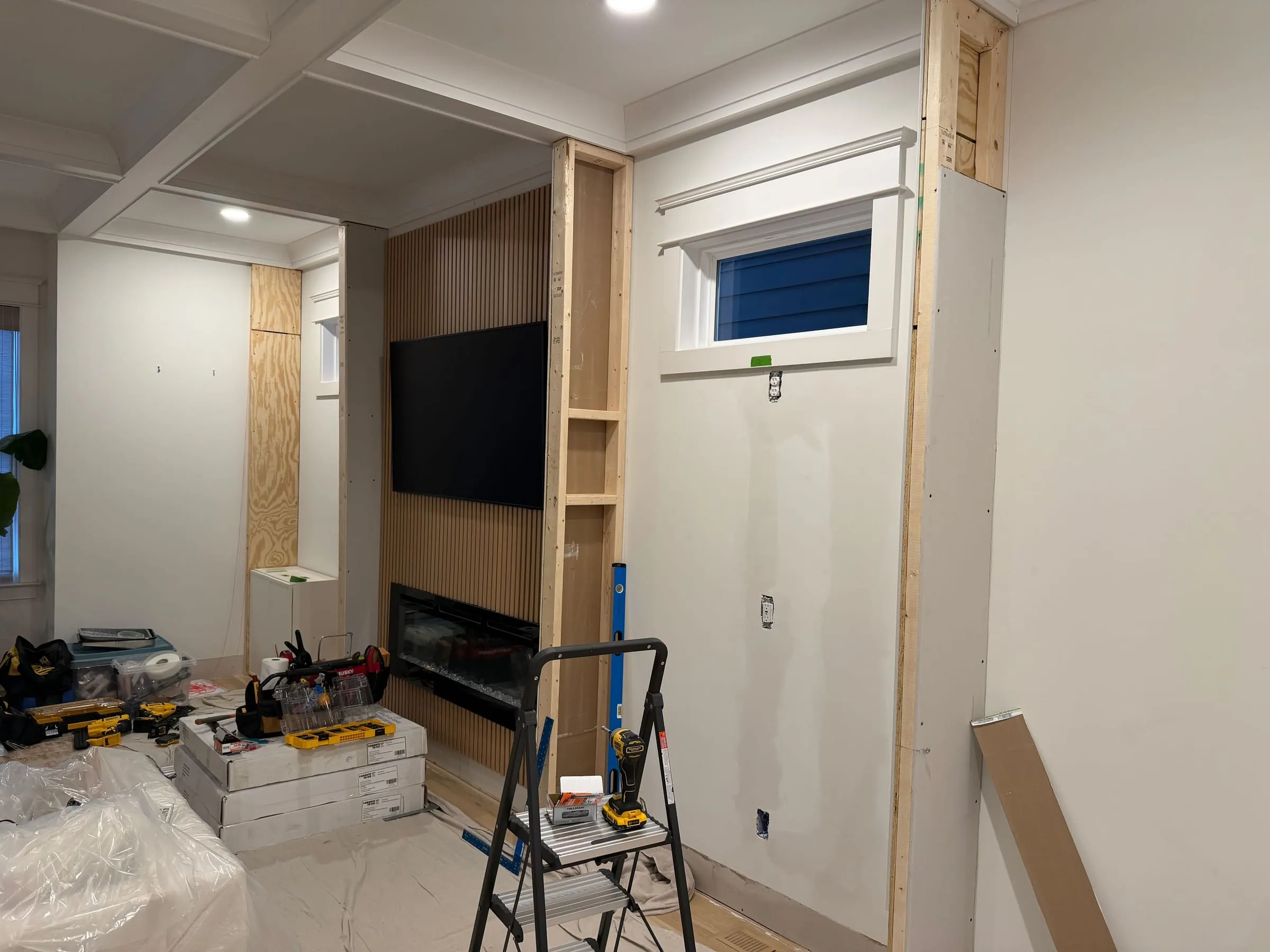
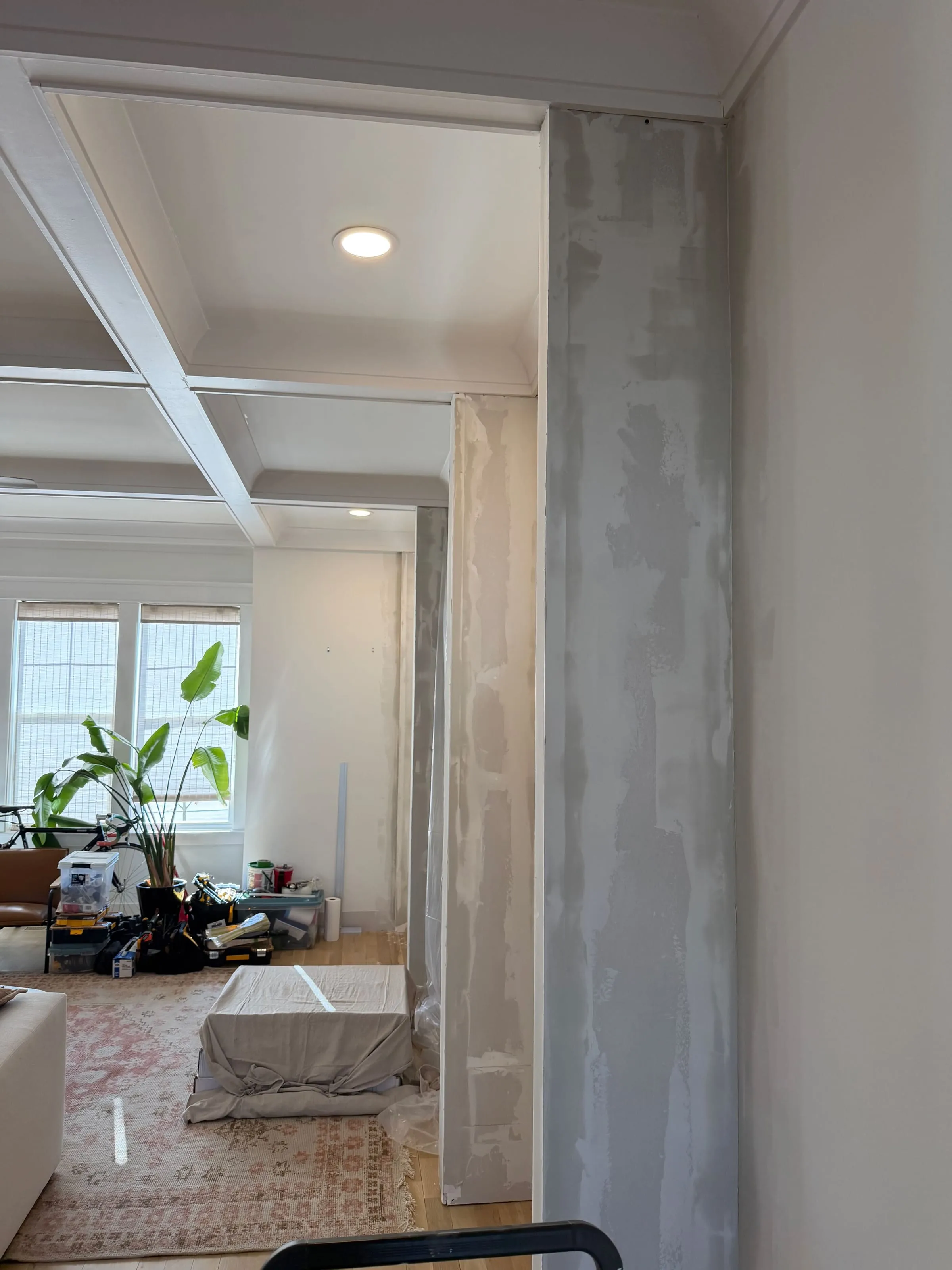
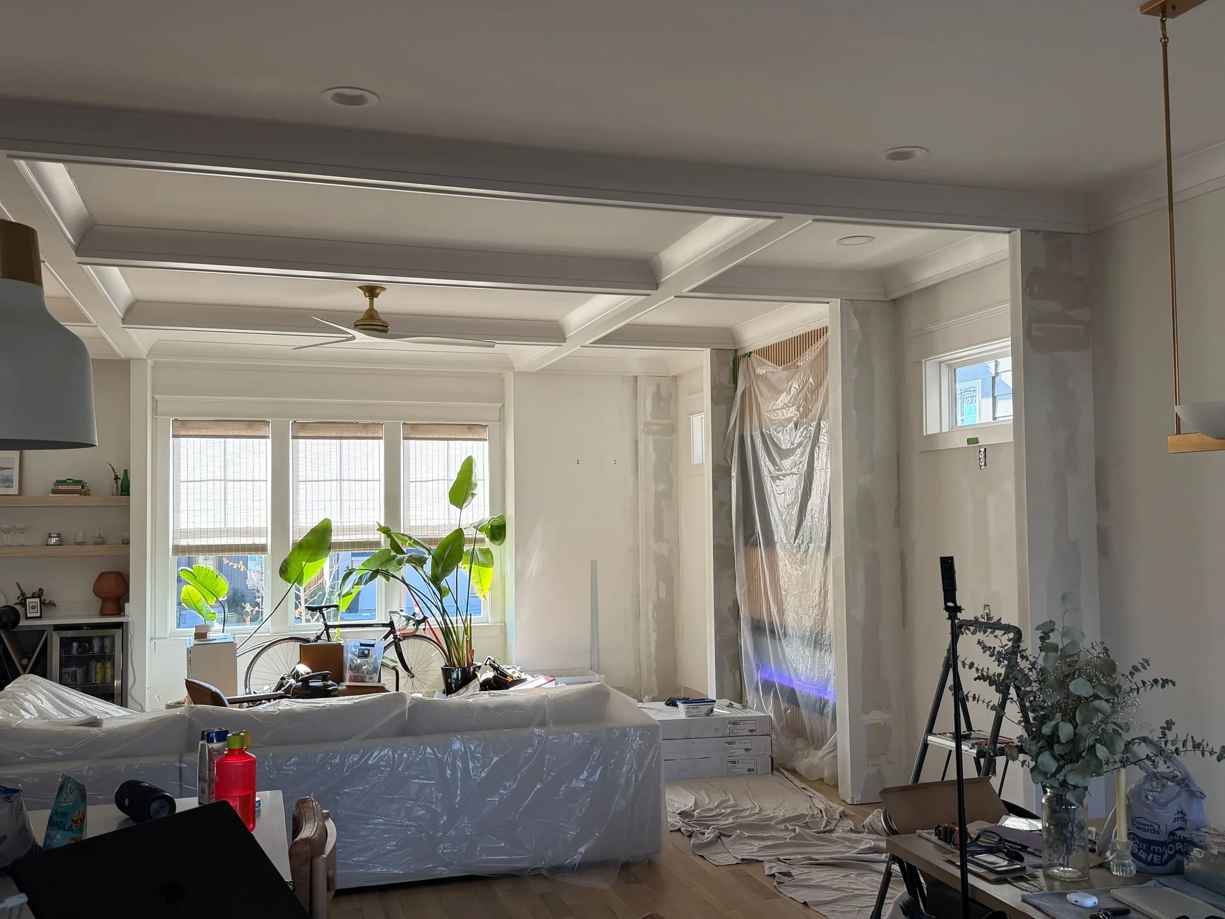
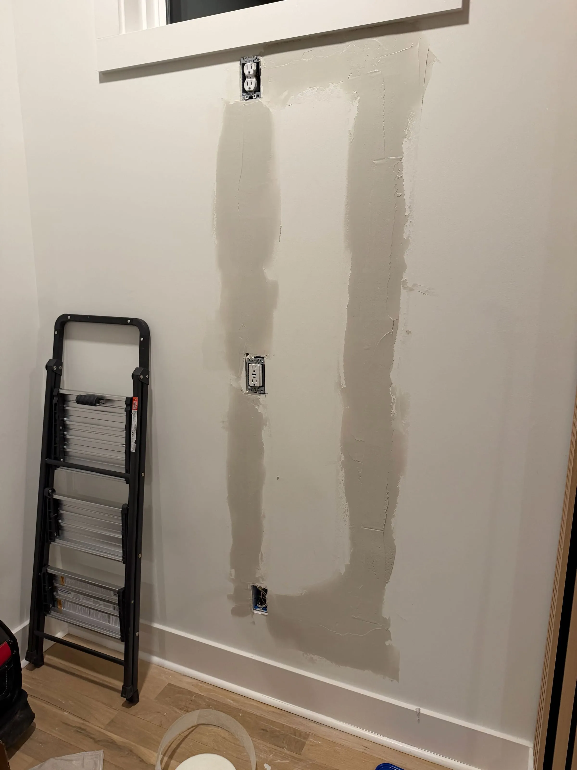
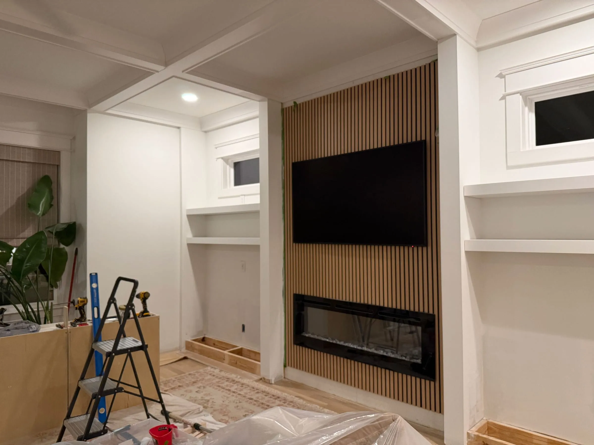
The new structure was then sheathed in drywall and finished to a Level 5 standard, not as a luxury, but as a way of making the surface calm enough to disappear. When a surface is truly calm, it stops calling attention to itself, and the life in front of it becomes more vivid. In this way, the shape of indoor space becomes clearer, not through dramatic form, but through the removal of noise.
II. Ceiling Transition and Careful Joints
The strength of a room is felt at its joints. Most rooms fail, not because the main idea is wrong, but because the meeting places are careless. So the connections were treated as the work itself. Special attention went to the column connections, ensuring that the towers met the ceiling beams and the existing window casings with a kind of inevitability, as if the room had always been moving toward this meeting.
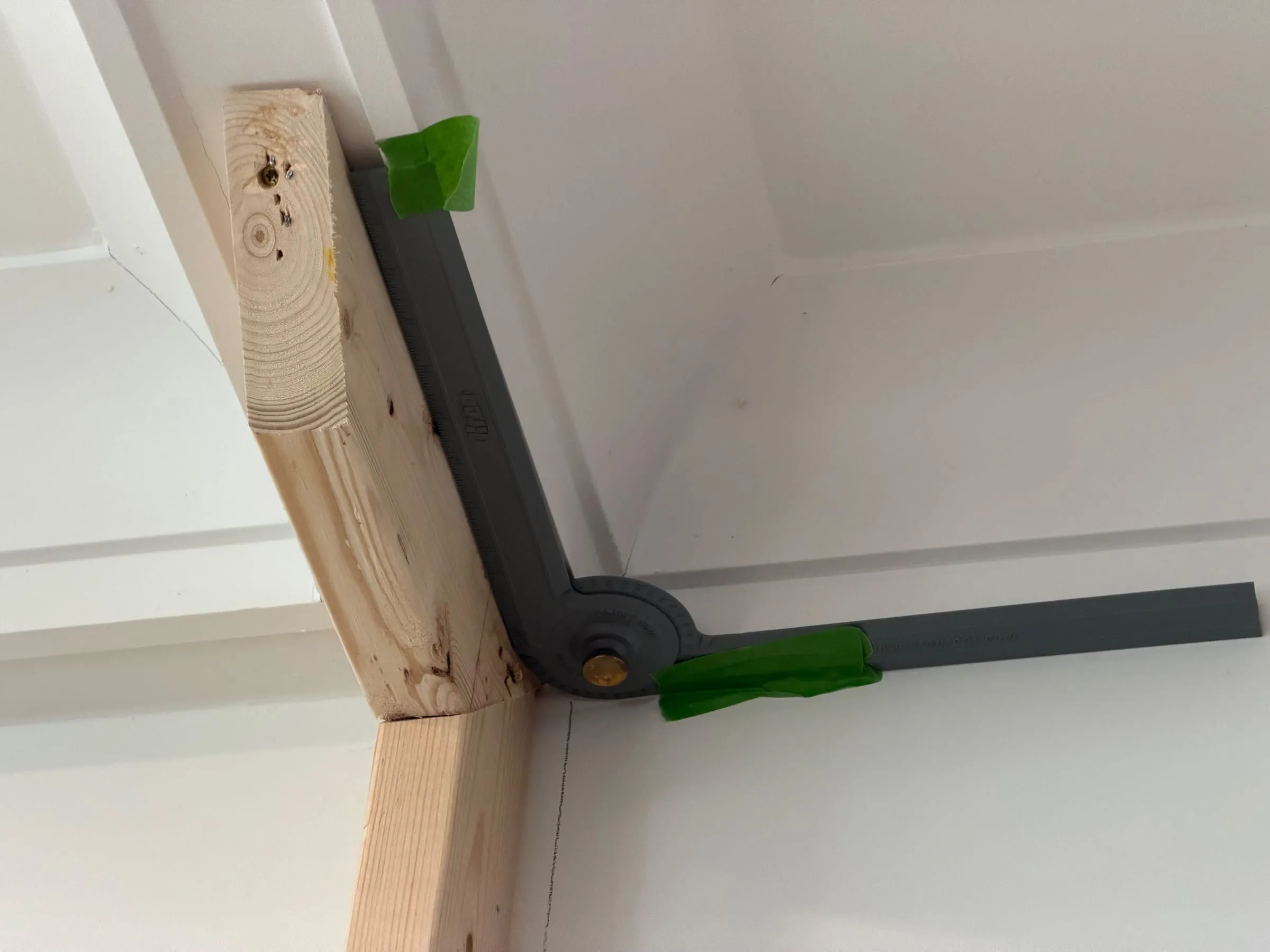
This is where the room either fights itself or becomes whole. When the new work meets the old with respect, the eye does not stumble. The hand does not catch on awkward edges. The body does not sense conflict. The transitions become continuous, and the room begins to speak one language.
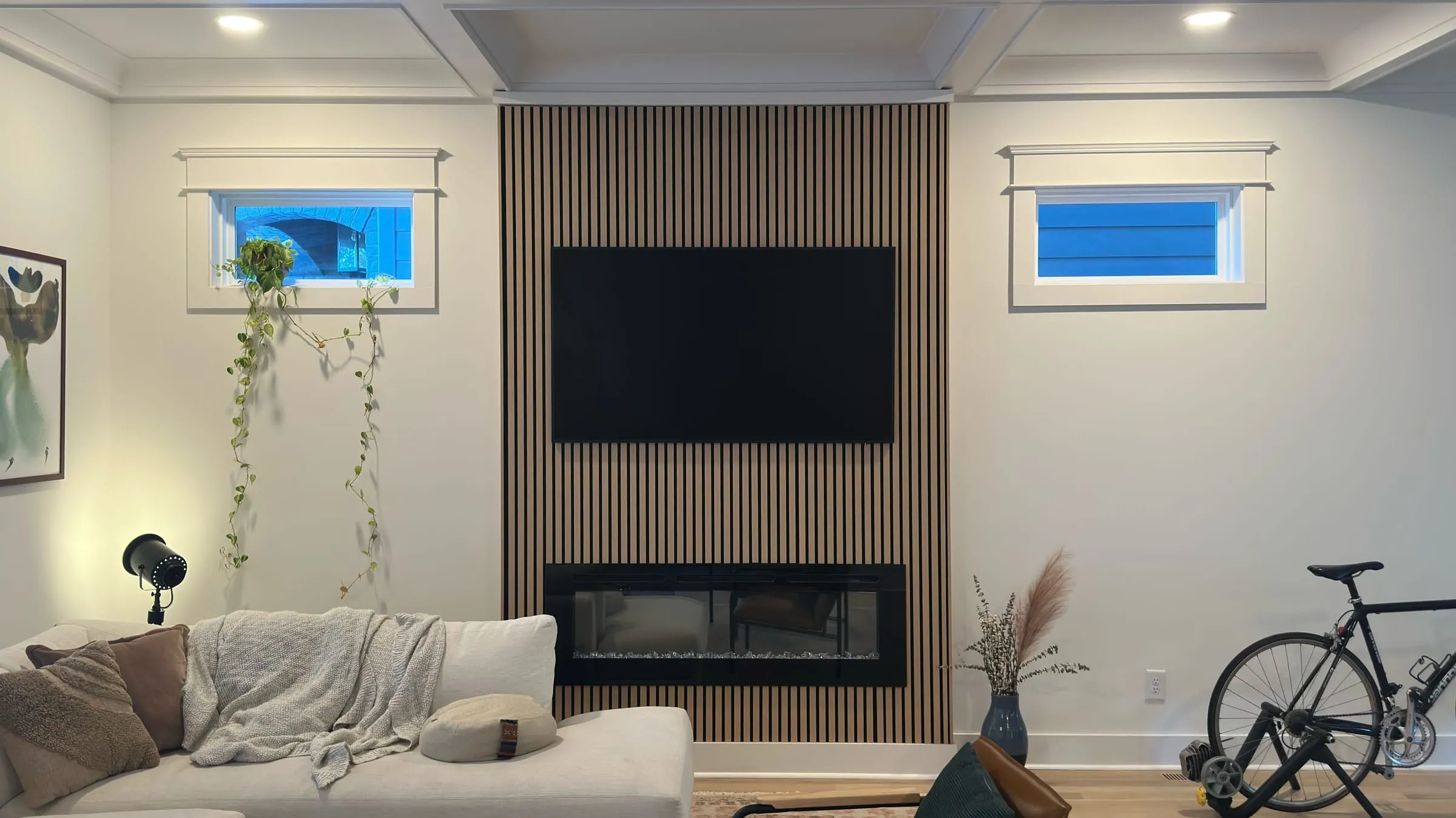
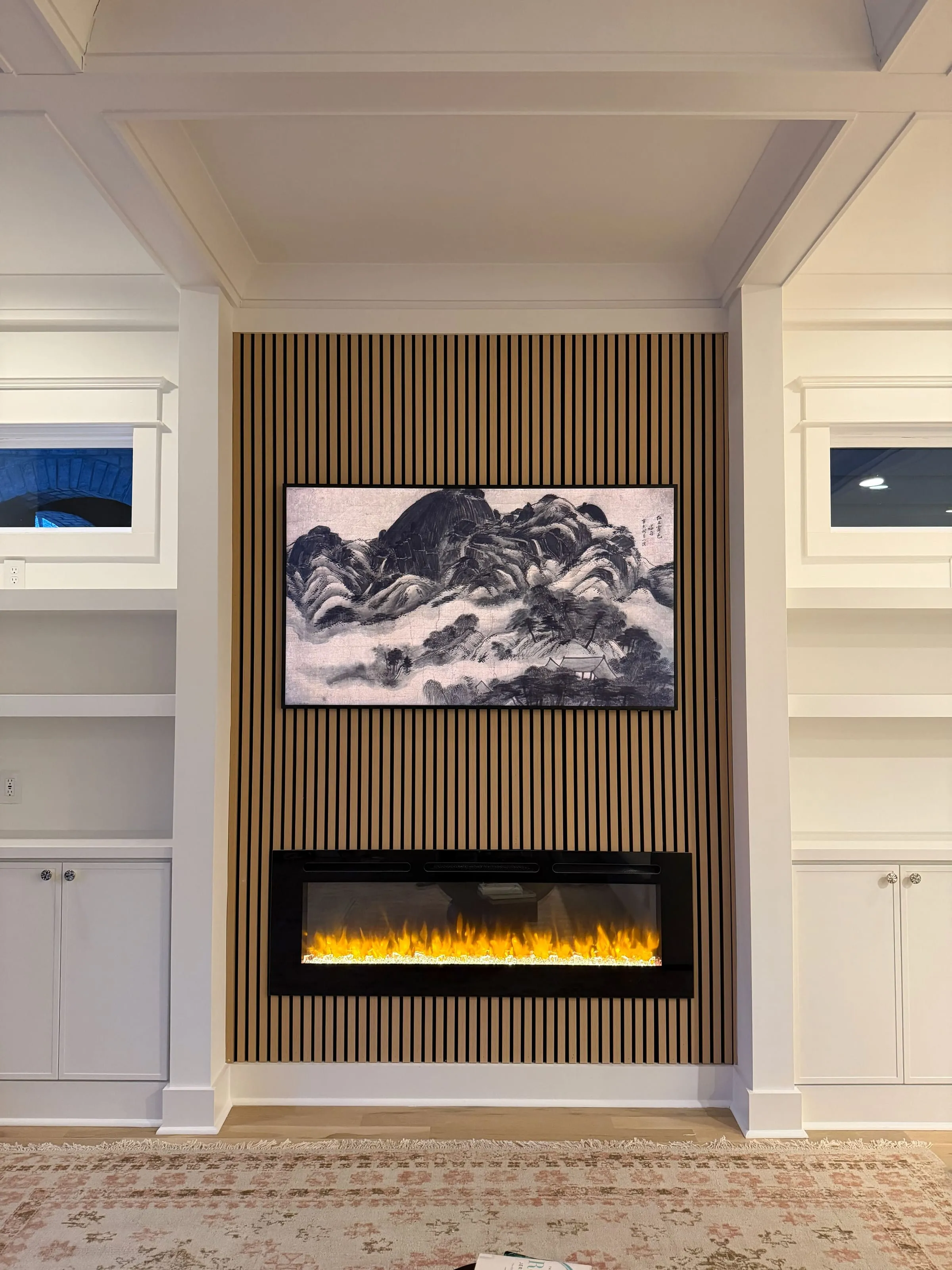
Reinforcing the corners and giving the vertical edges weight strengthened the feeling of columns at the corners. These corners do not merely frame the built-in. They gather it. They tell the room, without announcement, where its center is. The ceiling vaults and beams can then lead the eye downward, not in a dramatic gesture, but in a slow, natural descent toward the hearth and the shelves.
III. Cabinet Bases, Airflow, and Countertops
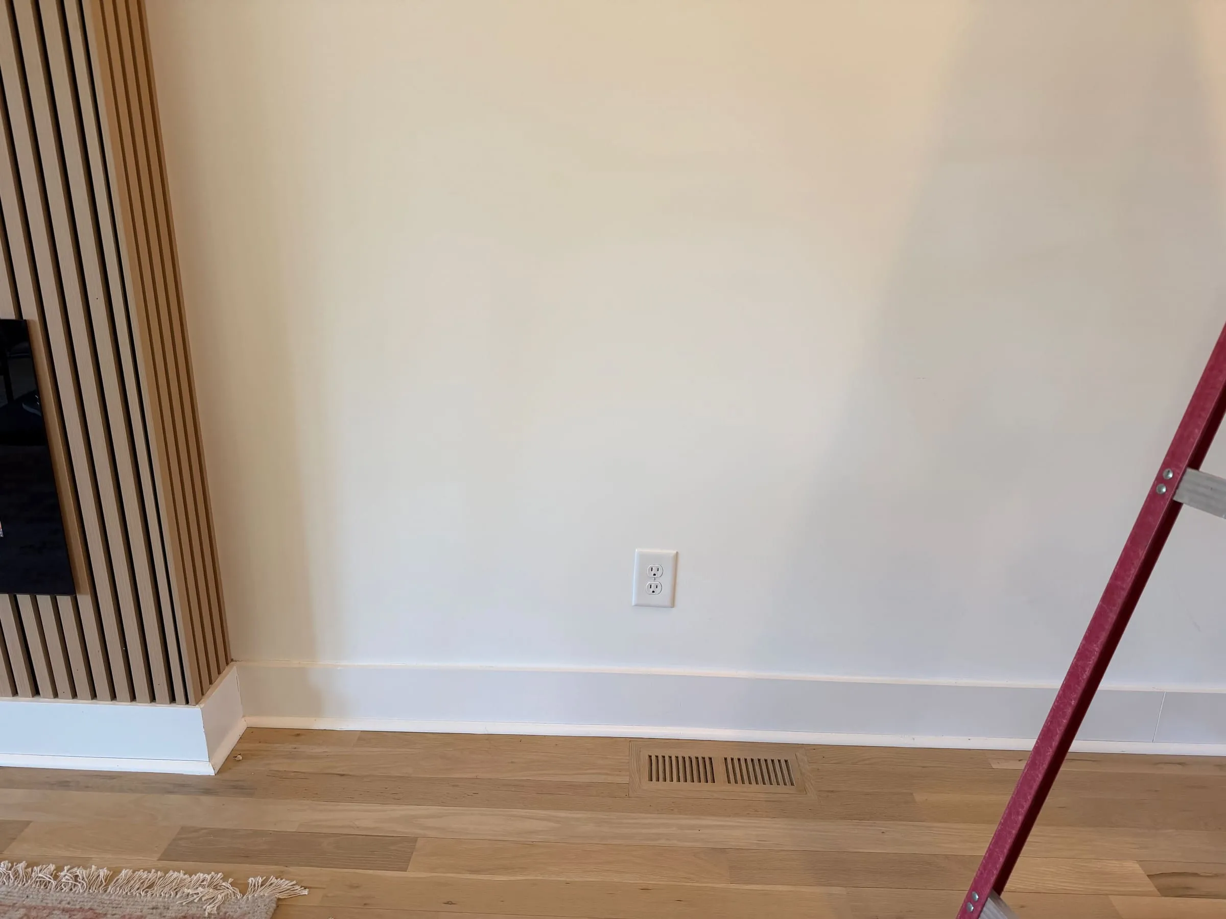
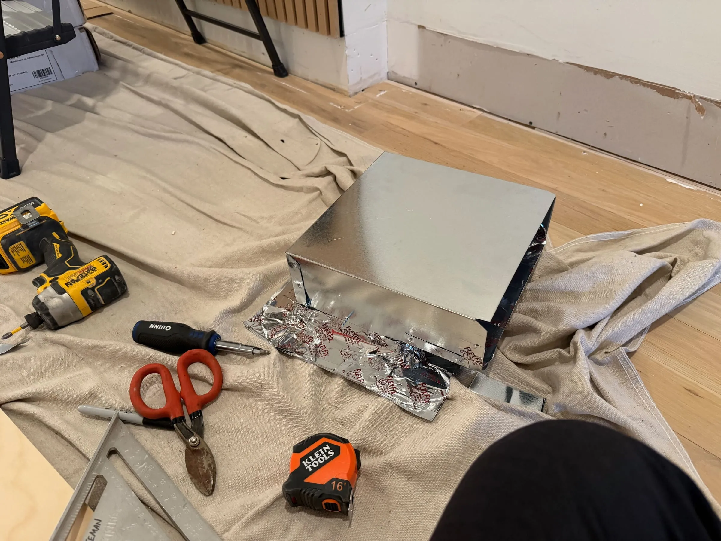
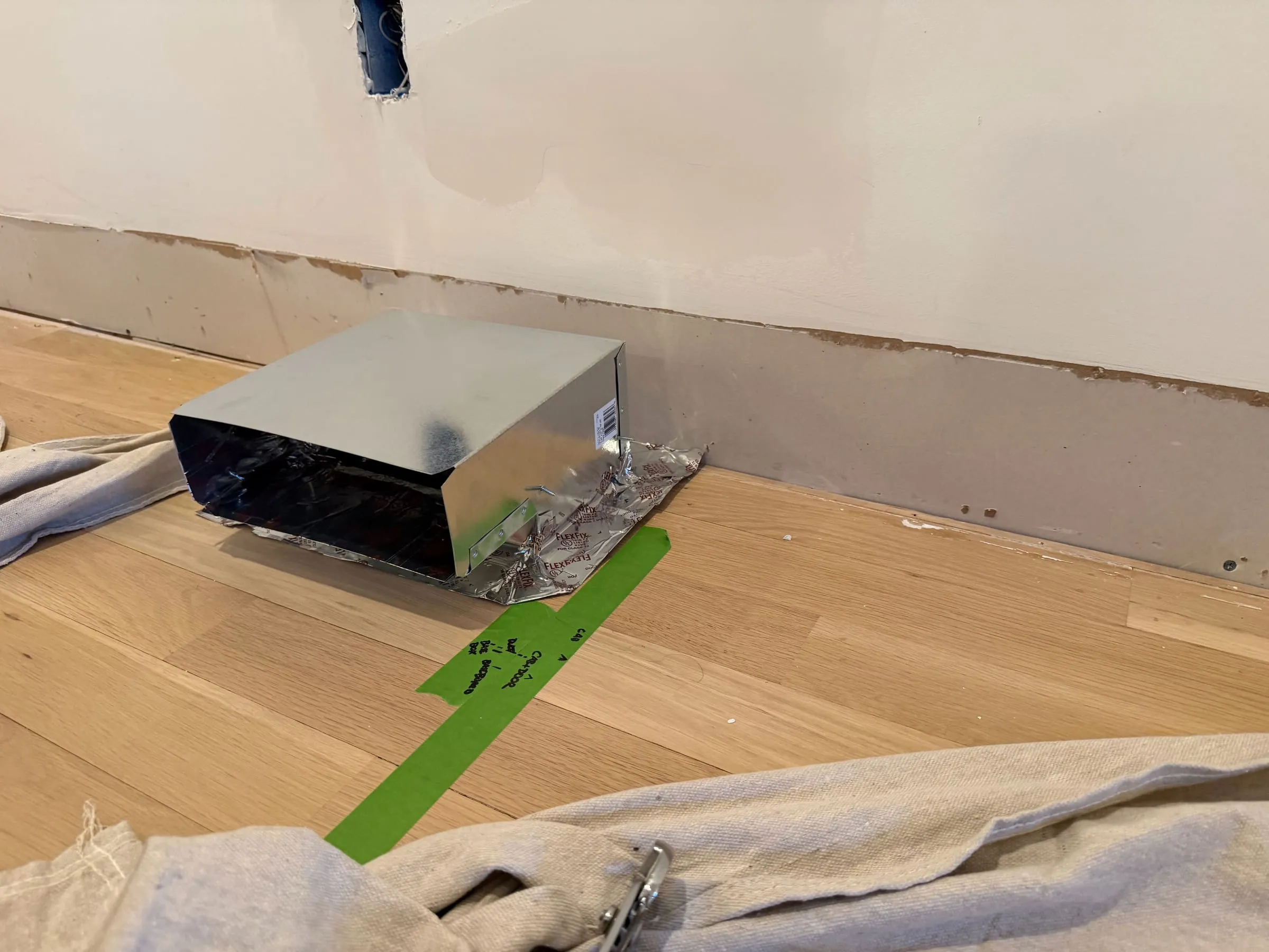
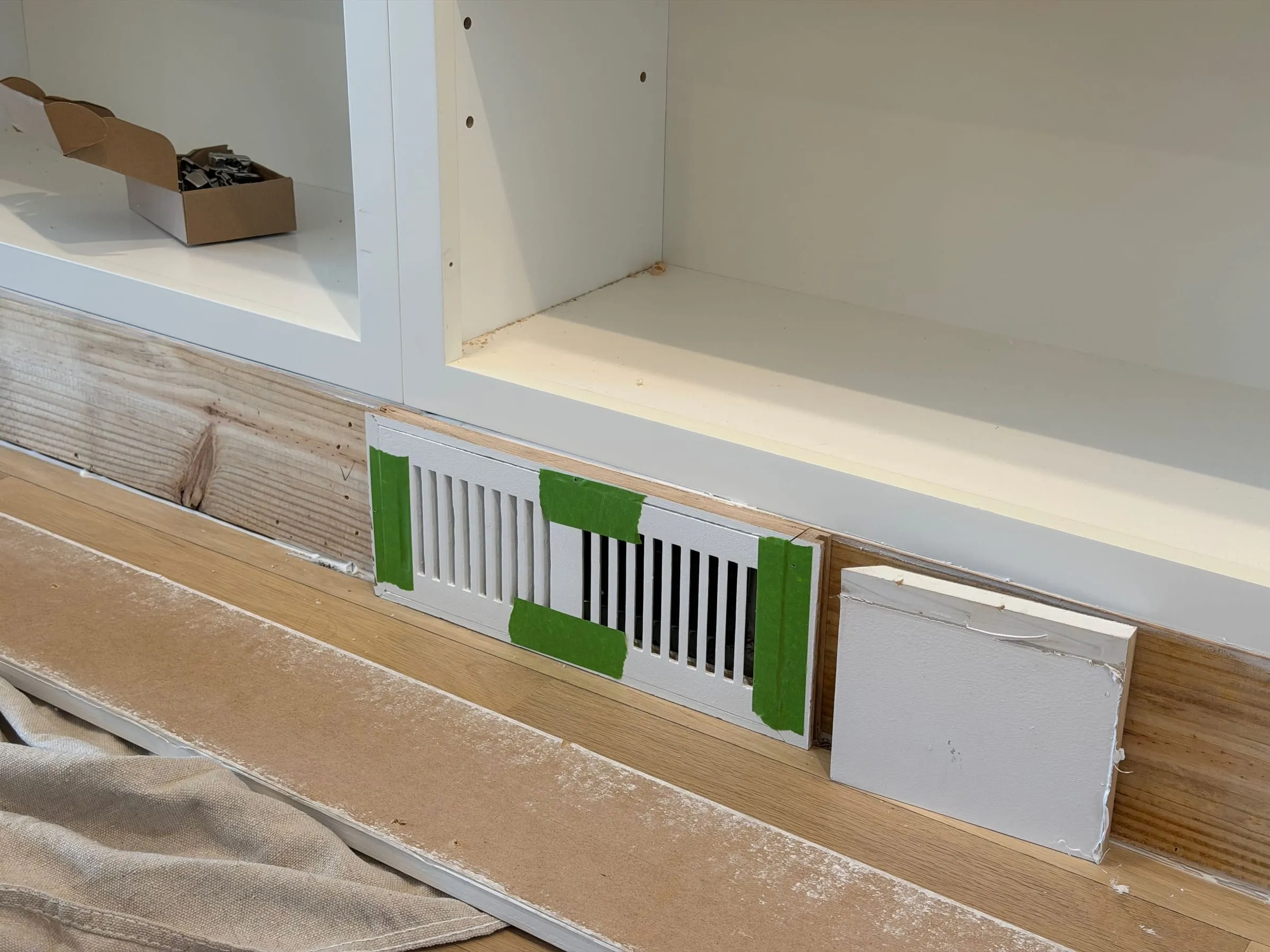
A room must breathe to be comfortable. If the air cannot move, the place becomes subtly tense, no matter how beautiful it is. The cabinet bases had to sit over the floor registers, so they were built to let the air keep moving. Not by ignoring the problem, and not by pretending the room could adapt to discomfort, but by giving the air a clear path out.
The bases were shaped to lead the warm and cool air out through the toe-kick, so it could still reach the people who live here. This is the kind of detail that no one points to, yet everyone feels. When it is right, the room is simply comfortable, and no one thinks about why.
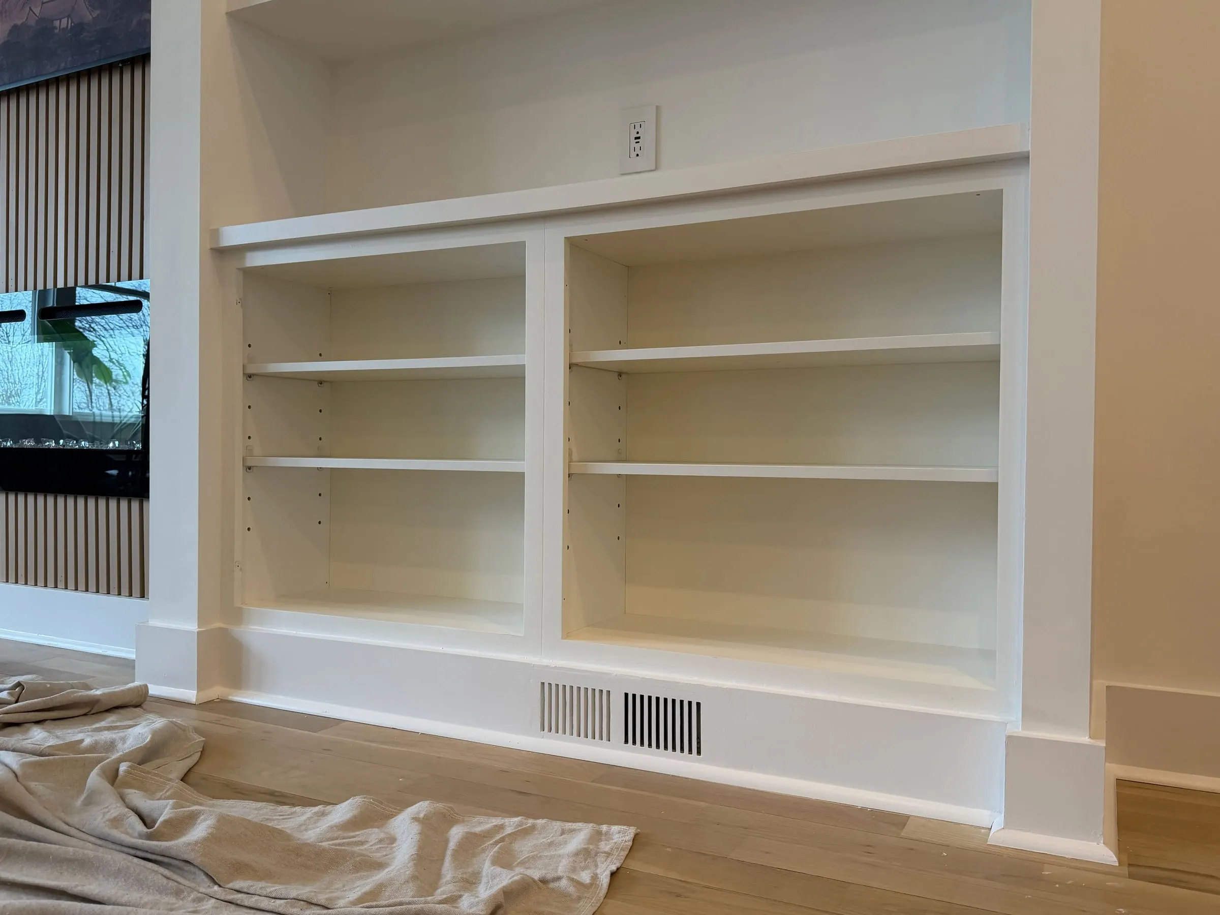
Then came the countertops, set flush to the windows. This is not only a matter of alignment. It is a way of catching the day. A sunny counter is an invitation. It turns sunlight into something you can use, something you can lean into, something that softens the edge of the room. Even if no one ever sits there, the presence of a surface in the light changes how the room feels. The niche becomes warmer, not because of paint, but because the sun has a place to land.
IV. Outlets and Light
To make a place truly functional, the patterns of light and power must be felt but not seen. A living room cannot be alive if cords and outlets dominate the eye, yet it also cannot be alive if lamps and media have no natural support. So the built-in was planned around the room’s power, with outlets falling where they serve the everyday life of the room, not an abstract plan.
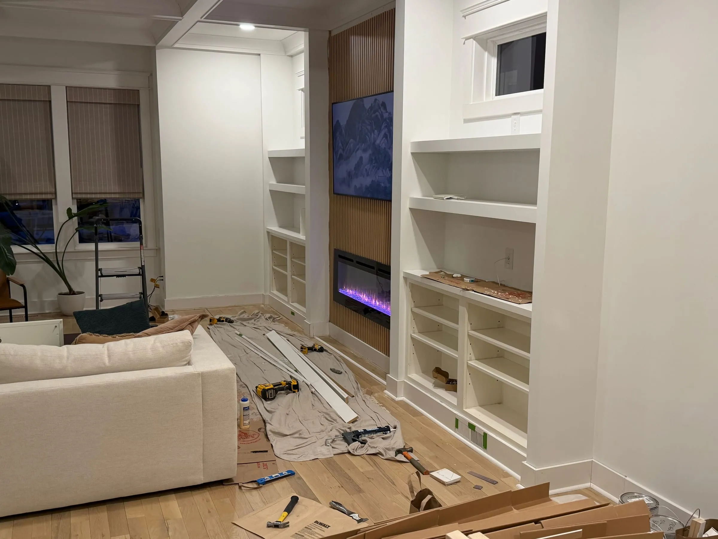
This supports a tapestry of light and dark, because the built-in creates depth, and depth creates shadow, and shadow makes the light more precious. The niches are deeper and more inward. The shelves recede. The wall no longer shines all at once. Instead, the pools of light from lamps and from the fire stand out as distinct islands, each one a small center. When a room has these centers, the evening becomes gentle. The body relaxes. People speak more softly without knowing why.
Even the small upper windows contribute to this sense of ease. They act as a zen view, not as a dramatic scene, but as a brief opening for the eye. A glimpse of sky. A thin slice of daylight. A pause that lets the gaze settle before returning to the warmth inside.
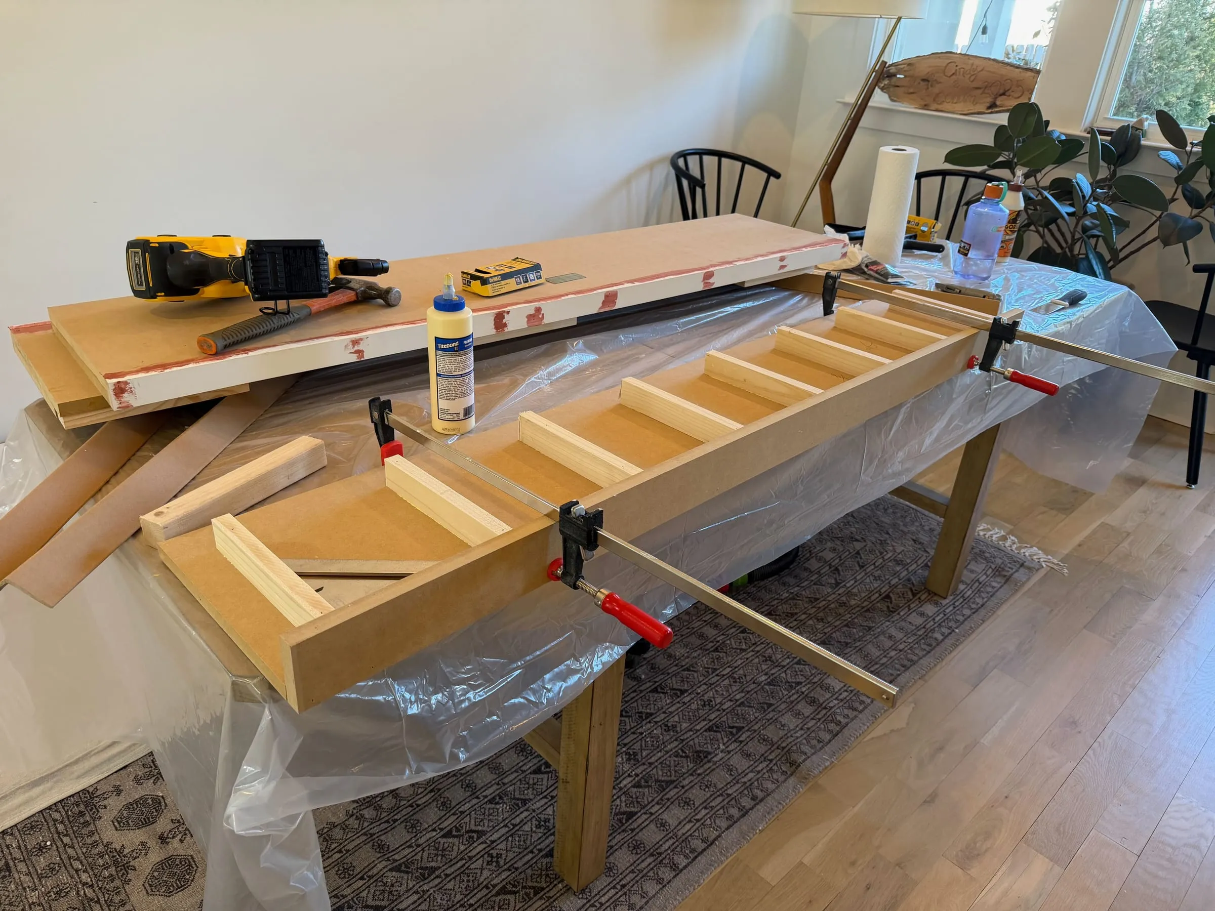
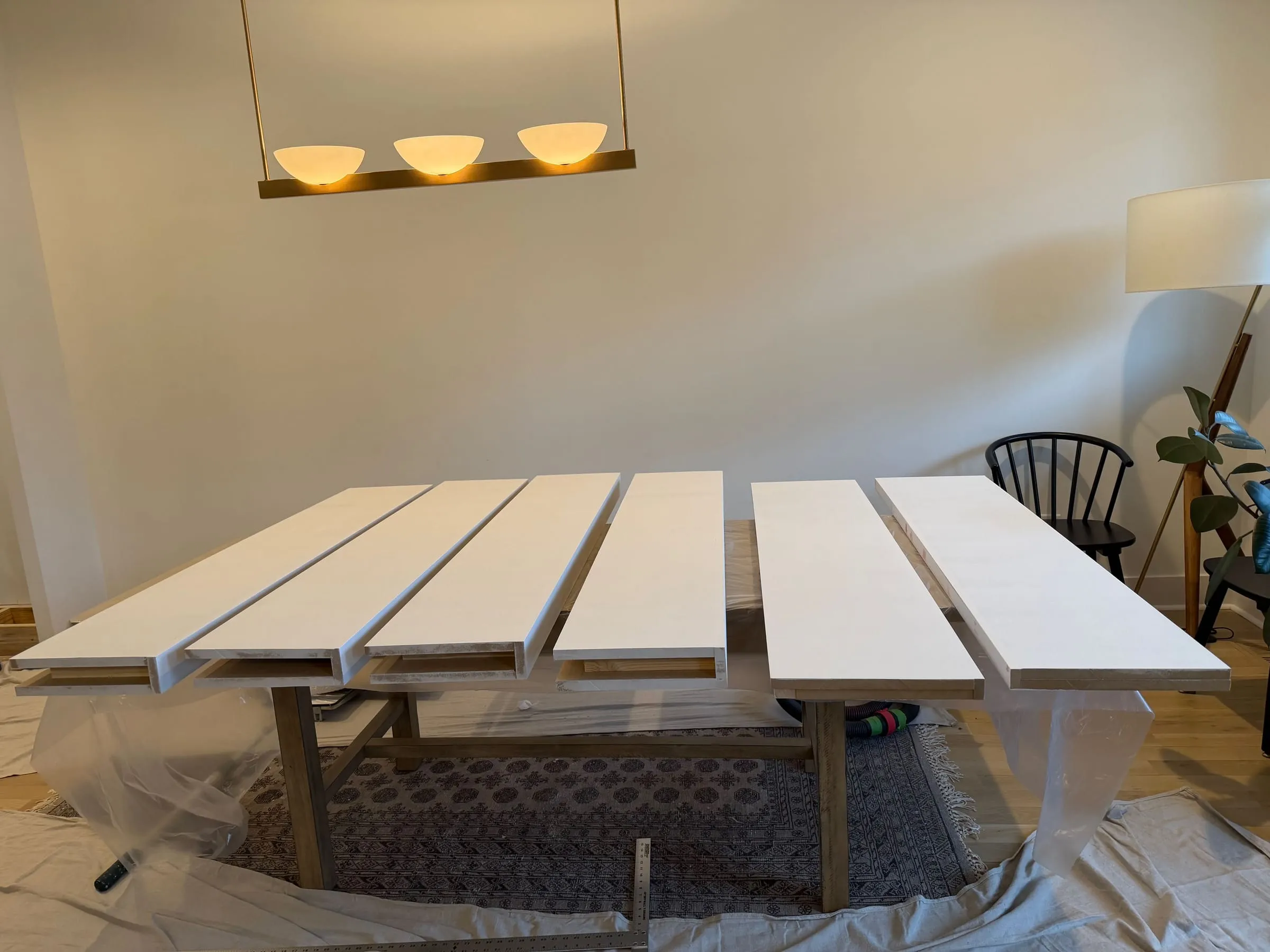
V. Floating Torsion-Box Shelves
The shelves had to carry weight, because life has weight. Books have weight. Objects have weight. The small treasures of a family have weight, not only in pounds, but in meaning. Yet the shelves also needed to feel calm, not heavy and oppressive. They needed to float, so the wall could keep its air.
Each shelf is a hollow torsion box that slides over a wooden cleat, an internal skeleton that does its work in silence. This gives the shelves a comforting heaviness in the hand, while allowing them to appear effortless in the room. The eye reads the shelf as a clean line. The body reads it as strong.
And because these are open shelves, they become a place for things from your life. Not staged objects, not generic decor, but the real items that carry memory. The shelves invite one-deep placement, so the life of the family is visible, reachable, and honest. This is not display. It is presence.
VI. Trim, Fitment, and Paint Finish
No wall is perfectly straight. A living house is full of small irregularities, and these irregularities are not defects. They are the record of time and making. So rigidity had no place in the work. The work was scribed to the wall’s path, so the new structure could meet the old with intimacy. When this is done well, there is no anxious gap, no line that feels like an apology. The work sits close, as if it grew there.
Where the new structure meets existing window casings, half-inch trim finishes the joints between materials and keeps the scale human. Thin trim is not a minor detail. It is the fine edge that allows the whole to feel resolved. It absorbs small imperfections. It gives the hand a clean boundary. It gives the eye a delicate line to read.
For the finish, a urethane trim enamel was hand-sanded to 320 grit. The aim was not shine. The aim was stillness. A surface that holds light rather than throwing it back. A surface that can live through years of touch and dust and sunlight, and still feel settled. Warm colors, and warm materials, let the light read as comfortable rather than harsh, even when the room is bright.
The Result
What was once a flat wall is now a common area at the heart. It does not merely store books. It holds the room together. It gives the eye a place to rest. It gives the hand places to put things. It gives the day a way to enter, and the evening a way to gather.
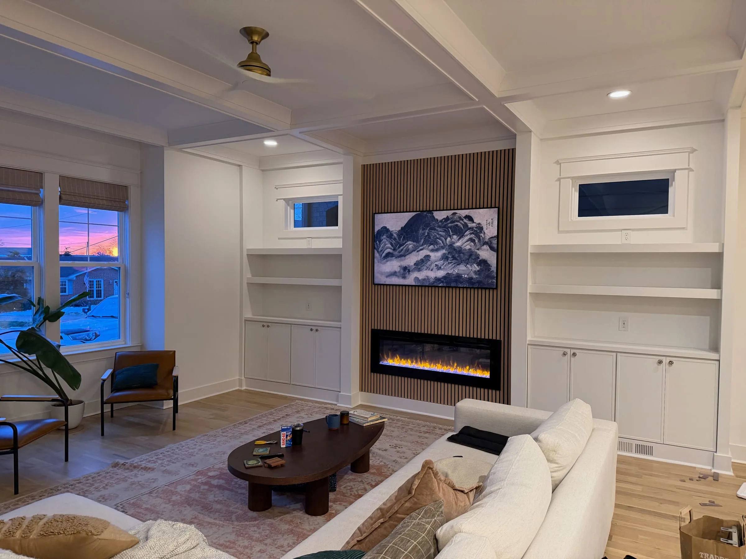
The built-ins frame the fire so it can act as a true center, not as an appliance on a wall, but as a hearth around which life naturally collects. The art and the shelves and the shadowed niches are not separate features. They are one composition, one body, one settled arrangement that feels as though it has always been there.
And this is the only real measure. Not the neatness of the lines. Not the cleverness of the details. But the way the room feels when someone walks in on an ordinary night, and their shoulders drop a little, and they sit without searching, and the space seems to recognize them.
When that happens, the wall has become a place. The room has found its true shape.